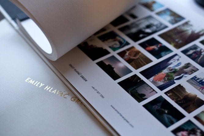
Recently a photographer showed me the prototype of a book he’d had designed. It was full of gorgeous images from an award winning story he’d shot in Thailand.
That would have been wonderful but instead of a clean background there were strange textures and patterns printed on the page beside the images which threatened to overpower the shots.
‘I thought it would add something’ he said, when I asked about it.
Holy moly if that’s not photo sabotage I don’t know what is.
Those shots were so powerful I just wanted to explore the image and discover the nuances of each individual story.
Instead the photographer was unintentionally trying to distract me.
I’ve seen this kind of thing so many times.
- A background image running behind the gallery of images on a website and making it super hard to see the shots.
- Colourful logos with an image clashing beside well-balanced photographs.
Good designers know that to enhance your images they must create breathing space and balance. Simple logos and fonts, and space that enhances your images.
Much like making a good photograph really.
If you’re investing in a book, a website, or a promo piece, less is more.
And if you’re targeting people who are visually discerning, for goodness sake give their poor brains the space to appreciate what you do.
Honestly your work (and those elusive creative decision makers) will thank you.
Understanding your target audience is one of the things I’ll be touching on in my free webinar ‘Your Client Attraction Process’ on Tuesday 8th August (Monday 7th UK/ USA)
 Marketing
 Folios & Editing
 Finding Direction
 Asia Assignments
 Personal Work
 Closing the deal
 Most Recent
 Case studies
 Interviews