A recent visit to the supermarket had me reeling in shock. When I got down to the back of the huge building, I was confronted by a queue which lead all the way past the bakery, the deli, the meat and ultimately to the dairy section. People with half-full trolleys, baskets, and some with nothing, waited patiently in line. I asked one of them why they were queuing.
‘Lewis Road Chocolate Milk’ they replied.
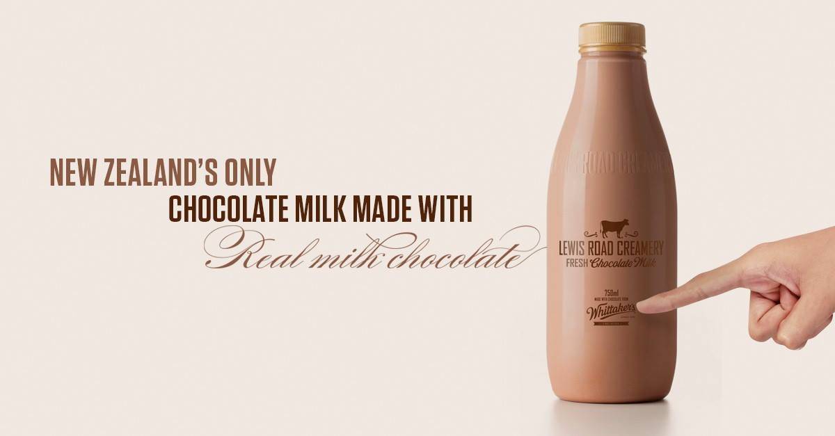
It turns out that the recently launched product (milk, with chocolate flavouring folks, we’re not talking about a rare species of truffle here) was due to arrive at 2pm and due to a shortage of supplies there were queues all over New Zealand. I took a photo and instagrammed it. The news channels hummed with it. Social media sites were a-buzzing with conversations on how to get hold of it. This happened many times over several weeks.
How did Lewis Road Chocolate Milk get to be so popular? I mean seriously, this is New Zealand- we are flooded with milk products. Including chocolate milk. I’m no market analyser or research specialist, but I can hazard a guess at some of the reasons. They’re all key points from which photographers (also flooding worldwide markets) could learn.
I listed a few:
1. Great packaging
I have to admit, Lewis Road Chocolate Milk is the classiest looking product in the dairy department. A clear bottle with nicely designed type (internationally recognised typographer Len Cheeseman’s doing I suspect). It stands out a mile when surrounded by the mountains of cartons and containers with garish look-at-me! typography, logos and star bursts.
How does your brand look on the shelf? When someone is looking at your website is it clean and classy? Or is it a great big mess of tabs and images (and yet more images) and logo (God forbid it is a colour logo with a picture- tell me you didn’t do that- please) and whatever else you felt the need to add? Take a look at it and make sure you’re Lewis Road and not Budget Butter Inc.
2. Perception of quality
Never underestimate your customers. When your brand looks classy, people assume it is a better product. Even the ones you think don’t appreciate good design.
Whenever I ask photographers to remove their more commercial looking, dumbed-down images from their website they often freak out that those customers will stop coming to them. ‘They won’t get this personal stuff’, they say. “It’s not their kind of thing! They need to see I can shoot a burger!’ Trust me, they will keep using you. They’ll just feel privileged and proud that they are using someone so good.
A word of warning though- you have to behave professionally all round. Your response, your attention to detail, your service, must all reflect the quality of the brand. Otherwise you might as well not bother.
3. Higher price
Quality doesn’t come cheap. Lewis Road chocolate milk is more than double the price of its competitors! And yet it didn’t stop people without a brass razoo queuing, and paying big bucks. The point is that just because something is the most expensive on the shelf doesn’t mean it won’t attract people of all types. They will find the money. And hey, if they can’t afford it, they’re probably not the target market.
I work with a lot of photographers. I have to say, hand on heart, the ones getting the best jobs are charging a premium price. When I was an agent I was aware that there were other photographers out there getting lower budget day-to-day work, but as soon as the client had a decent budget they would come to us. They perceived us as a premium brand. Are you a premium brand? Or do you drop your fees at the whiff of a job?
4. Collaboration with other popular brands/ entities
Whittakers Chocolate has a great following and many loyal customers. If you’re not a New Zealander you should seek it out- it’s good! Lewis Road teamed up with this established, quality brand and created a product that could potentially attract the same following. I guess it worked. Such an effective way to get immediately exposed to a similar target market.
I always recommend that photographers collaborate. Team up with brands targeting the same clients to create an amazing photographic event. Team up with a client to bring amazing design to your own promotional work, or to your socially-conscientious idea. Team up with a well-known artist to bring another amazing dimension to their work, and yours.
Photographer and filmmaker Joseph Michael collaborated with the best soundscape artists to add a crucial finish to his beautiful time-lapse series.
5. Scarcity
Busy people with kids and soccer drop-offs and birthday parties and full-time jobs waited patiently in supermarkets all around New Zealand on a sunny Saturday afternoon for the 2pm delivery of Lewis Road, whilst all the usual demands waited for them. Yes- insane! But a reality. Having said that, Lewis Road, in their efforts to keep people as happy as possible, regularly communicated expected delivery times and explanations for the scarcity.
I know first-hand that if a client/ creative/ art-buyer wants a photographer badly enough they’ll move heaven and earth to fit around your schedule. The only thing you need to do is to keep communicating, make an effort to be flexible, and show that you care.
Of course, they won’t even contemplate working around you if you’re not perceived as a unique, quality brand.
Take a look at your brand. Are you in the Lewis Road league?

 Marketing
 Folios & Editing
 Finding Direction
 Asia Assignments
 Personal Work
 Closing the deal
 Most Recent
 Case studies
 Interviews