Recently I heard the good news that yet another of my clients won the top prize in a photographic competition. What’s great is that he won it for a shot he took for a dream client, shooting the kind of job he would shoot even if he weren’t paid. Only he was. And on top of that, the prize money afforded him a new car. I’m so proud that he was brave enough one year ago to throw out all the shots he thought people wanted to see, and stick to only showing what he wanted to shoot.
I often have to throw out photographer’s babies. One of the reasons I started the Top Shots series (in need of an update!) was to prove that some of the best images don’t necessarily a good folio maketh. But it doesn’t mean they aren’t fantastic. They just don’t have a place in that folio, or on that website, at that particular time.
Here are 5 reasons you should consider throwing out a beloved shot (or two):
1. It’s not the kind of shot you’re passionate about shooting in the future.
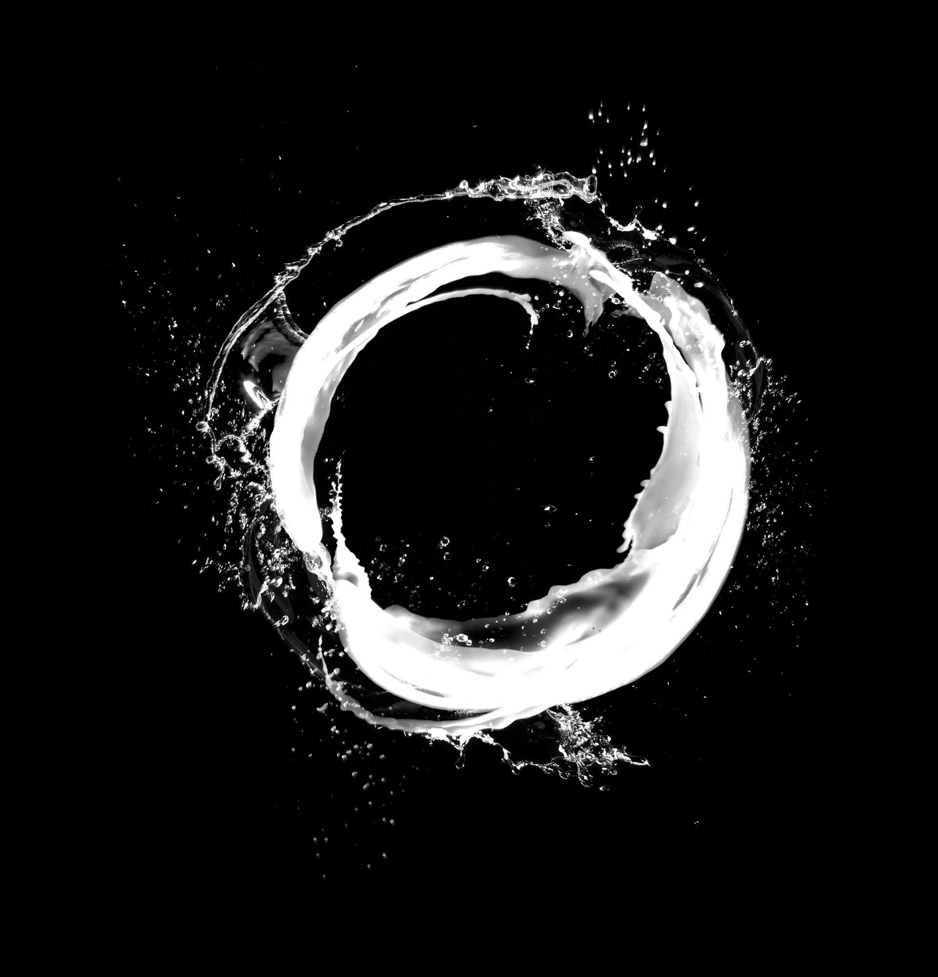
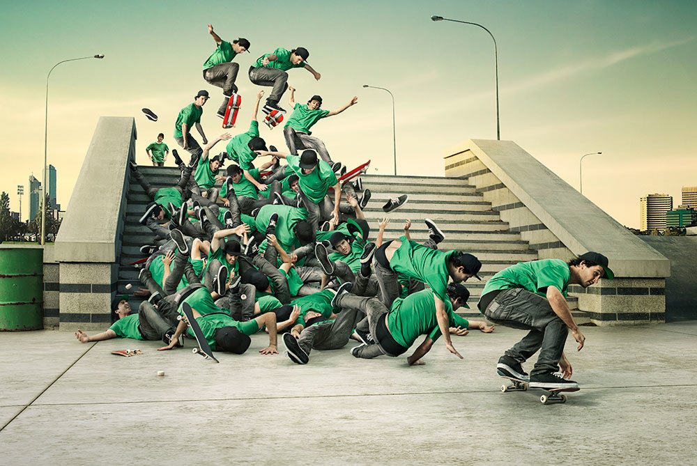
I don’t care if you shot it just last week, if it was the biggest job of your life, if the queen is in the shot, or the client loved it to bits because you made a silk purse from a sow’s ear. If it’s not the work you enjoy doing, and are passionate about doing more of, throw it out. (You may keep it aside to privately share with the next client who wants to see a similar silk purse made out of a similar sow’s ear). Focus on building your website and folio with work you dream about. If necessary, start with stunning personal work; the commissions will follow.
2. It doesn’t flow well with the other images.
So ditch it. Even if it’s the best image you’ve ever made, and you think, ‘This is where I want to go’, you can’t show a random image unlike anything else in the folio. Firstly, it will confuse your potential clients; ‘So what does she shoot- soft, misty, ethereal landscapes? Or high end retouched conceptual product? Huh?’
Secondly, if someone likes it enough they may ask you for more examples so they can show their client. To which you will say, ‘Ummm, well actually I haven’t got anything as yet, but I’m working on it.’ To which they will say, ‘Hey, thanks for the estimate that took you a week to pull together, but if I have nothing else to show my client I’m stuffed and we’ll have to use photographer B….’
Instead, avoid this pickle (which I’ve seen many times) and concentrate on building more shots like it (if that’s what you want to do more of), and wait until your next folio update. If not, print it, frame it, and give it to your mum for Christmas.

3. There are lots of shots from the same series
Conversely, if you have too many shots from the same series you risk boring the viewer. And you might give the impression that you are lacking in good work so have padded it out. Three shots from a campaign or similar series is enough in one go. So throw out the weakest ones and leave the strong ones in. And if you have loads and loads of great images from a series, consider making a blog from them, or an exhibition, or a themed mini-book (or all three).
4. It isn’t terribly good.
I cannot believe the utter tripe I see in folios and on websites. Inevitably, the said tripe has been shot by quite talented photographers. So why is it in their folio? ‘Because I see stuff like that all the time in ads’, they say. ‘Because that’s what clients want me to shoot’, or ‘Because no one wants to see my personal work’. Oh please, give me a break. Creatives and even direct clients aspire to using someone who shoots stunning, beautiful, dramatic, [insert appropriate positive adjective] work.
How do you know what has happened to that poor old shot on the billboard you drive past every day, the billboard you so doggedly think you must emulate? Maybe the photographer was made to shoot talent the client provided. Maybe the ad agency used their dodgy in-house retoucher. Maybe the client got hold of it and insisted on making the light match the original illustration rather than where it would naturally fall (this is another live scenario I have seen). Maybe the creative, who initially briefed the AMAZING photographer on the job, hates the final shot! If all the afore mentioned scenarios happened, it is most likely the poor designer probably cringes every time he drives past the billboard. So for goodness sake, don’t assume that’s what he’s looking for. No way Jose. You must give that dejected, compromised creative something inspirational to look at when you walk into his office with your folio; something that will put a smile back on his face and remind him why he signed up for his career in the first place.
5. It is covered in ugly typography.
It doesn’t matter that it’s been published in a magazine or as an ad if the design is ugly. Even if the shot is amazing, bad typography will kill it. Trust me, it doesn’t take a lot for designers and art directors to dislike the font someone else used. Even on award-winning ads. I have seen, first-hand, groups of creatives all verbally ‘fixing’ the typography on a Gold Cannes Lion winning ad. (The photography? It didn’t get a look in.) So keep that baby but get rid of the ad. You don’t need to prove you shot it for someone. You’re bigger and better than that.
Creatives in ad agencies have to throw out their babies all the time when they write, and rewrite, and rewrite them again, and again. Their bins are full of screwed up layout pad pages (yes, even in the 21st century they still start with scribbles). So take a leaf from their book, and be strong. It will be worth it. And they will thank you.
 Marketing
 Folios & Editing
 Finding Direction
 Asia Assignments
 Personal Work
 Closing the deal
 Most Recent
 Case studies
 Interviews